Brand Guidelines —
The purpose of our brand guidelines is to demonstrate a proper use of our visual identity, and provide access to the core elements of our brand. Playing by these few simple rules, we are able to ensure the quality of our visual communication, in analogue- as well digital media.
01.00 — Introduction
01.01 — Logo
01.02 — Colors
01.03 — Typography
01.04 — Photography
01.05 — Graphics

01.00 — Introduction
Through this brand guide, we aim to provide a comprehensive framework that empowers our team, partners, and stakeholders to consistently embody the spirit of Eberhart Furniture. It serves as a roadmap for communicating our brand identity, visual language, and brand voice with utmost clarity and consistency across all touchpoints.
01.01 — Logo
General —
Our visual identity encompasses several key elements, including our logo, wordmark, and logomark. Understanding the distinctions between them and their respective applications is crucial. Our logo represents a fusion of our wordmark and logomark, with each component serving as a fragment of the whole. Ideally, we should primarily utilize our logo, as it provides a comprehensive representation of our brand. However, there may be instances where the wordmark or logomark may be more suitable, although we encourage the predominant use of our logo whenever feasible.
It is important to note that our logomark is employed infrequently due to its reliance on prior brand recognition from the audience. It can be employed effectively as an icon, such as a favicon or app icon. Nonetheless, the general practice is to limit the use of our logomark.
The subsequent section offers a detailed elucidation of our logo, encompassing its origin, structure, and appropriate usage. Even if you are utilizing the logotype or logomark, we encourage you to consult these guidelines for accurate application.
Origin —
Our logo transpires the silhouette of one of our assembly rings, the same which we used for some of our first products – and in our products today. It is the emblem of our work, and it represents everything we do. It is the eye of our company, the thing that you remember first, and the thing you forget last. That is the simple reason why some standards must be kept when using our logo.
Space, Place, Size —


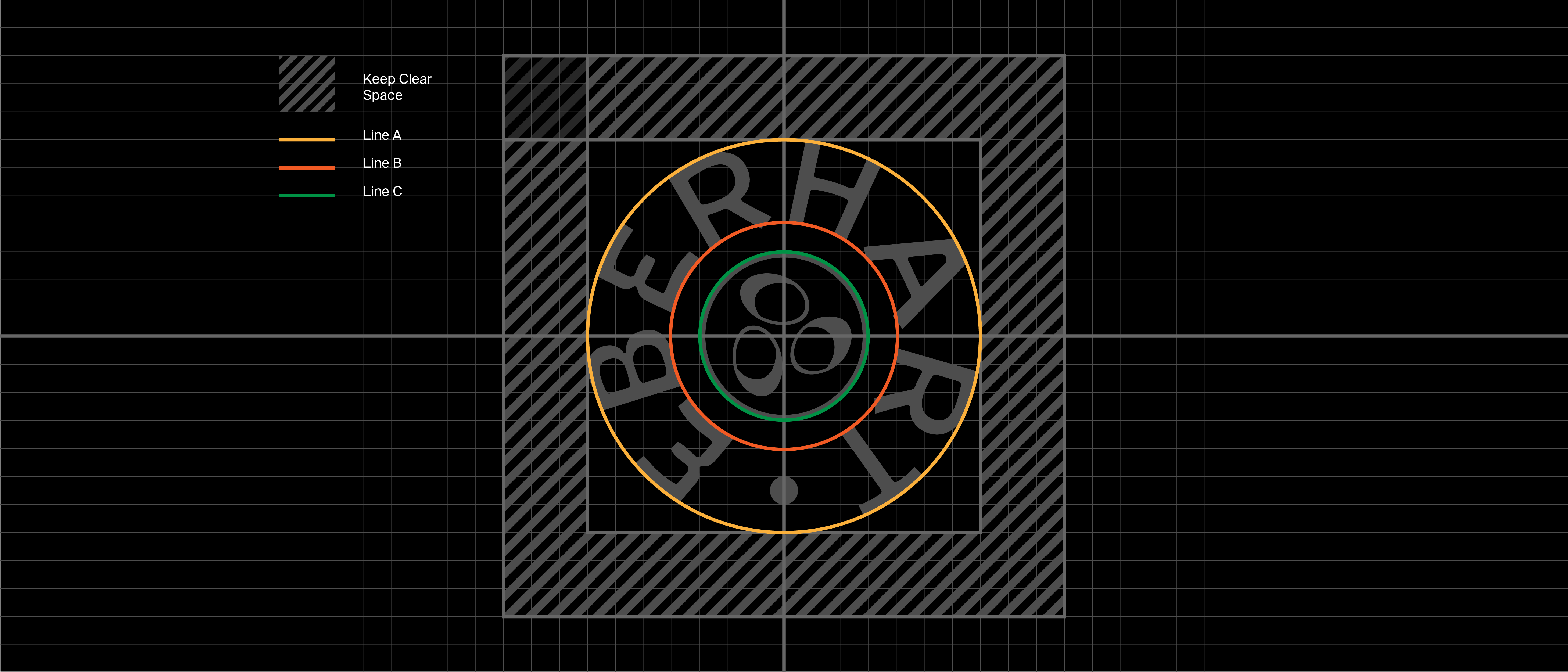
Our logo has a safe area to respect. This “clear space” is determined by the centered distance between line A and B. Do not place any graphics or contrasting elements from background photo material inside the safe areas in any circumstances.
We want to make sure that our logo is visible and readable when being used. As long we follow the basic rules on placing and spacing, the logo can be proportionately scaled to any size that seems right for the job. However, we do require a minimum size of the logo that is 90px for digital media and 15mm when used on print.
Do's & Don't —
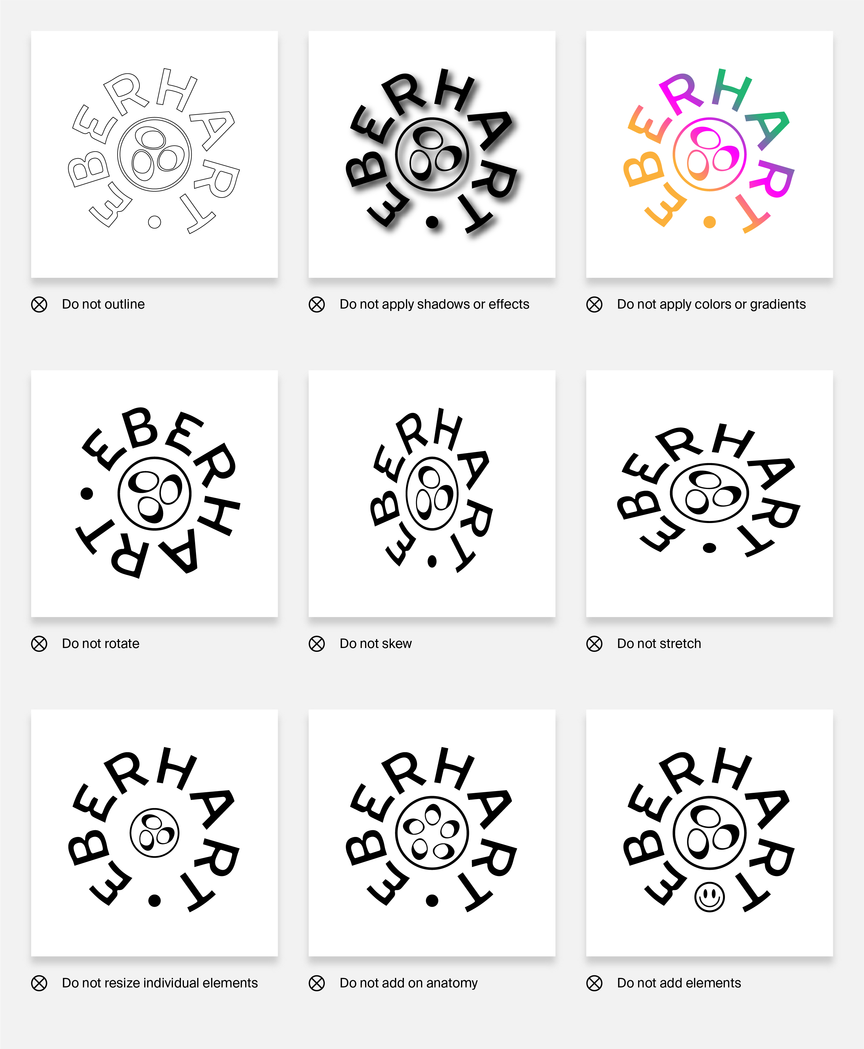
The way we want to display our logo should seem straightforward, however. If in doubt, rather just keep it simple; less is more. Do not colorize, use effects or in any way edit the original form and shape of the logo. We understand that there are plenty of ways to go wrong, but here are some examples of what we definitely want to avoid.


